Spotify Student Premium: First Trial Acquisition Campaign
An independent concept campaign created to demonstrate product marketing strategy, go-to-market thinking, messaging, and AI-assisted prototyping. Not affiliated with or endorsed by Spotify.
- Product Marketing
- GTM Strategy
- Messaging
- User Acquisition
- Concept Project
An independent concept campaign designed to demonstrate how I would increase first-time Student Premium trials for Spotify through product marketing strategy, audience positioning, messaging, and AI-assisted prototyping.
Business Challenge
Increase first-time Student Premium trials.
Target Audience
University and college students who use Spotify Free but have not yet upgraded.
Objective
Improve awareness of Student Premium benefits and encourage trial sign-ups through clearer messaging and a frictionless campaign experience.
- Independently developed the campaign strategy
- Defined the target audience
- Created the positioning
- Wrote the messaging
- Designed the customer journey
- Planned the campaign assets
Research & Assumptions
Outlined assumptions about student behaviour, affordability, and music streaming habits — students trade cost for convenience and switch to whatever removes friction fastest.
Positioning
Positioned Student Premium as an affordable upgrade that removes listening friction — half the price, none of the ads, verified in under a minute.
Messaging
Value-led messaging around uninterrupted listening, real savings, everyday convenience, and student lifestyle moments — study, gym, commute, party.
User Journey
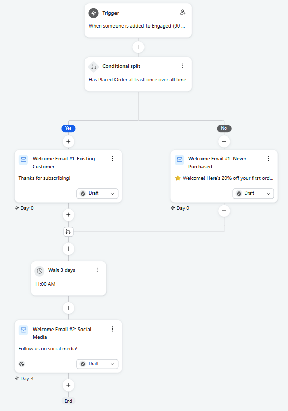
Awareness → Campaign Landing Page → Student Verification → Free Trial → Premium User. Verification kept short to protect drop-off between steps.
Campaign Assets
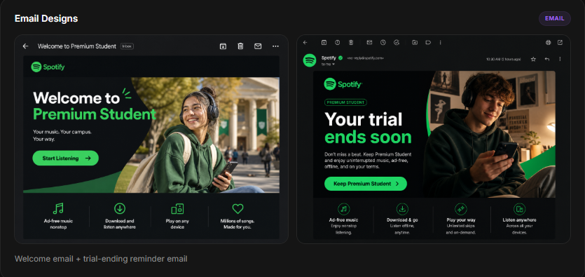
Landing page, email concepts, social media ads, student-facing messaging, and CTA variants — all coordinated around a single positioning line.
Success Metrics
Trial sign-ups · landing page CVR · CTR · student verification completion · CPA · trial-to-paid conversion rate.
- Trial sign-ups
- Landing page CVR
- Click-through rate
- Verification completion
- Cost per acquisition
- Trial-to-paid conversion
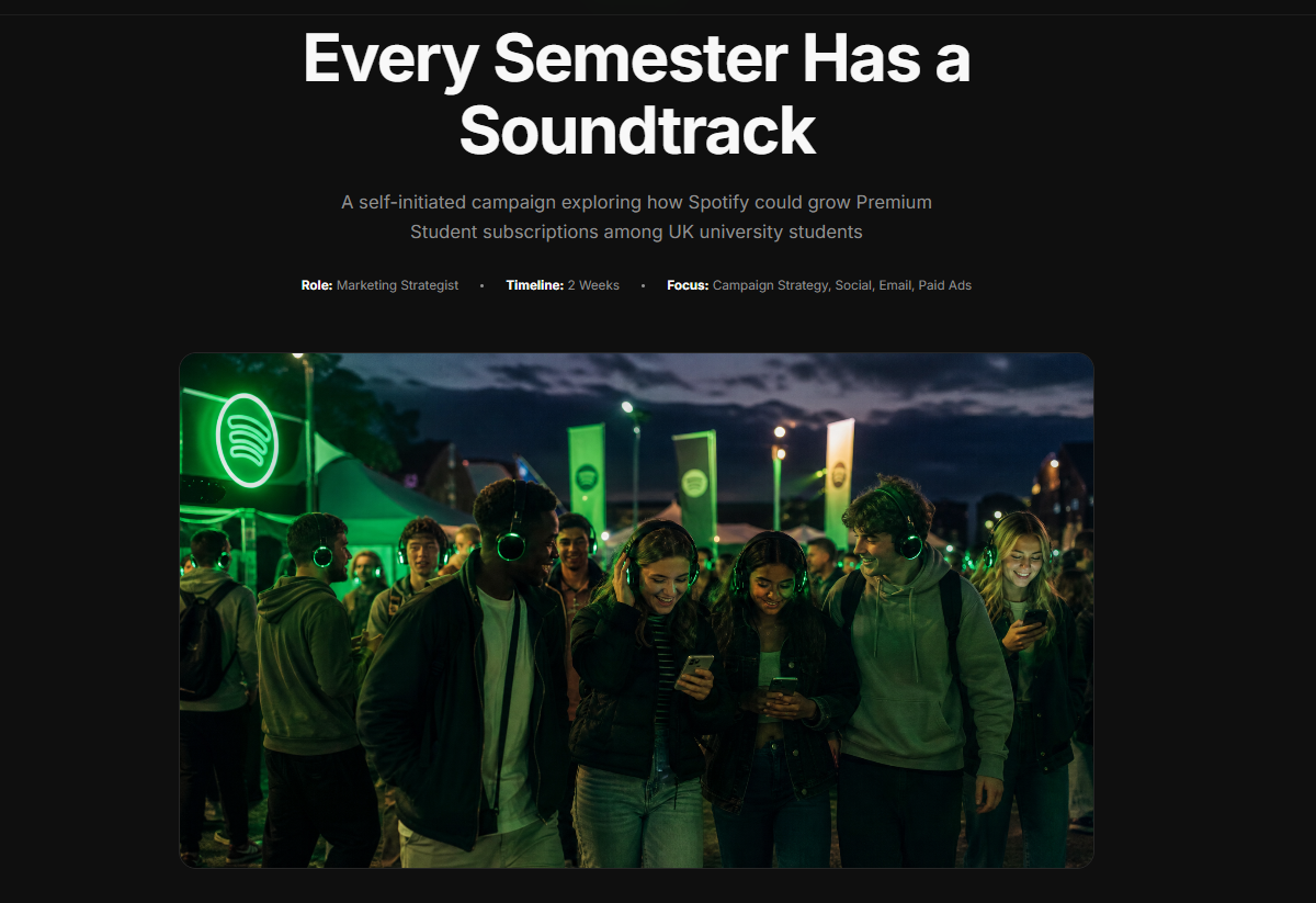
Open the live prototype
Interactive landing page walkthrough — student verification, trial CTA, and messaging modules.
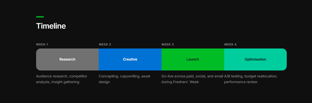
4-Week Campaign Timeline
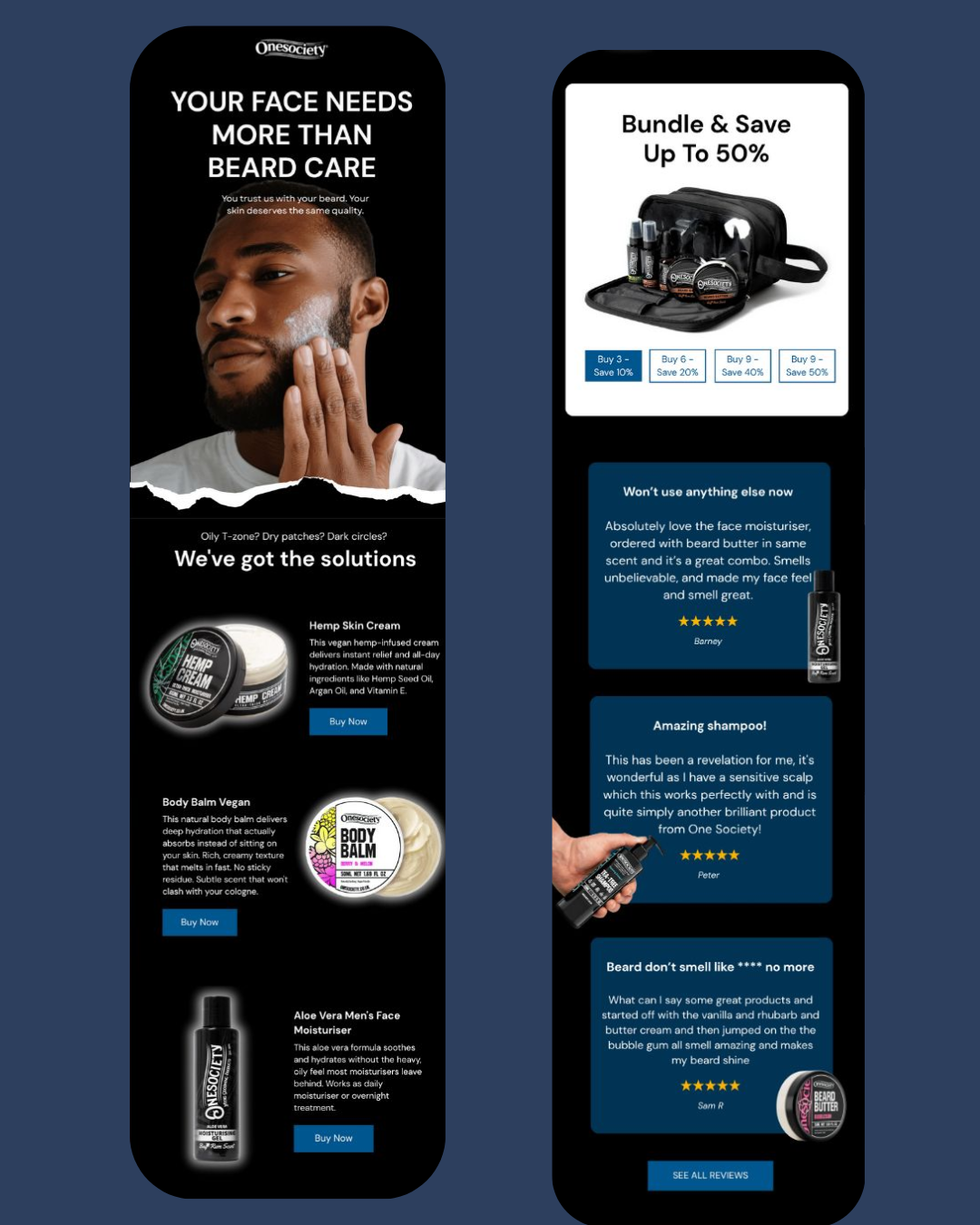
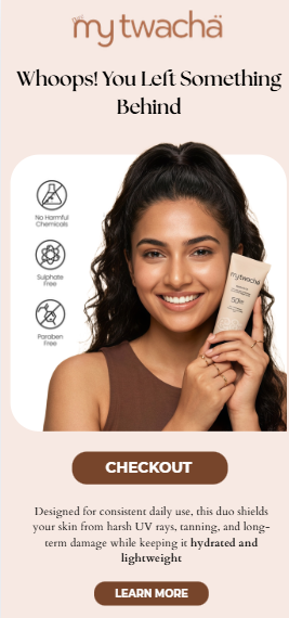
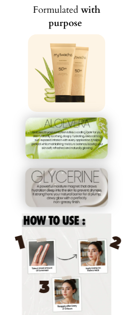
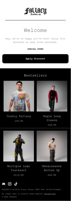
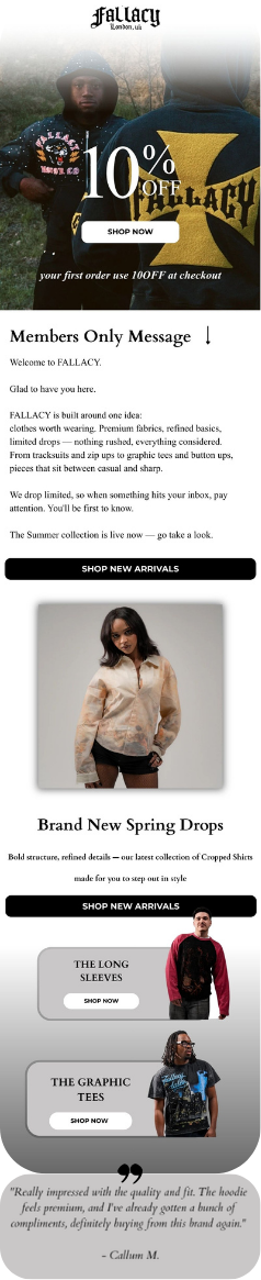
Email Designs
What worked
What worked
The messaging stayed focused on one value promise — cheaper, uninterrupted listening — and the flow was designed to reduce friction at every step, especially at student verification where drop-off is highest.
What I'd improve
What I'd improve
Validate the audience assumptions with real user research before finalising creative, and A/B test two or three distinct creative directions rather than committing to one voice up front.
Next experiments
Next experiments
Different value propositions · personalised messaging by degree stage · referral incentives · student ambassador campaigns · CTA copy and placement testing.